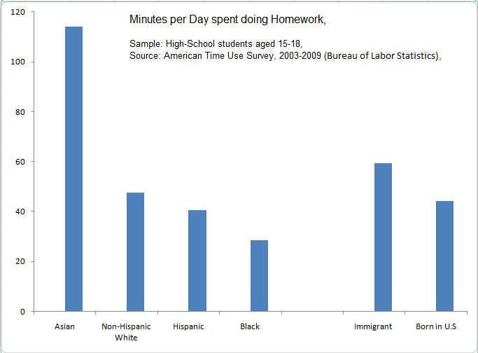
This chart, based on a Bureau of Labor Statistics time-use survey of teenagers, presents data for four racial/cultural groupings: Asian, non-Hispanic white, Hispanic, and black.
If the data are accurate, how far does the chart go towards explaining differentials across the races in grades, graduation rates, employment rates, and income levels?
Also interesting is the difference between immigrants and native-born Americans, which fits nicely with my anecdotal evidence.
So: Do your homework, kid! And then do some more!
Source for the chart: Tino Sanandaji’s Super-Economy web log.
