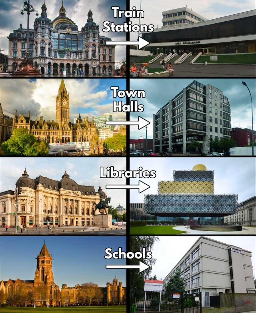
Much modernist and postmodernist architecture is ghastly. So there’s a point about making comparisons with older architecture.
But not this way:

Are the buildings on the left average buildings from 200 years ago? Or are they the best of 200 years ago, such that they were preserved while the 99% of average and terrible buildings from 200 years ago wore out, were abandoned, and/or torn down?
If they’re the best of the best from the past, then the proper comparison is to the best of the best now.
Does anyone really believe the buildings on the right are the best of the best? No, of course not.
So such graphics are selectively juxtaposing the best of one era with the mediocre-to-poor of another era.
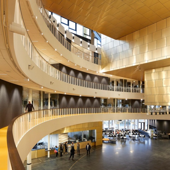
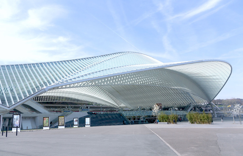
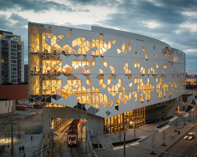
The following city hall, train station, school, and library may not be to one’s taste, but they are the kinds of buildings that should be compared and argued about:


Also: If one wants to argue that the contemporary is a decline from a glorious past, then these comparisons too should be made, and doing so will give one pause:
* The average family home of 200 years ago compared to the average family home of today.
* The average poor person’s dwelling of 200 years ago compared to the average poor person’s dwelling today.
Related: “How Art Became Ugly.” Professor Hicks lecture at ESEADE University, Buenos Aires.